Est. reading time: 9 minutes
Dedicated Servers
High-performance, bare-metal, dedicated servers with root, IPMI and RMM access.
Container VPS Hosting
Virtual servers give you the dedicated server experience affordably.
Linux Virtual Machines
Cloud-based Linux virtual machines powered by KVM.
Windows Cloud Servers
Windows virtual server hosting within the cloud for fast reliable connectivity.
Managed cPanel Servers
Managed cPanel cloud server hosting with priority support and daily backups.
Managed Colocation New!
Secure hosting for your critical infrastructure.
Accounting Software Hosting New!
Efficient, cloud-based hosting for accounting software.
Web Hosting
Take your idea or business online today with our shared web hosting solutions.
Email Hosting
Let your customers know they are dealing with a legitimate business by using a custom email address.
Site Builder
Build your own website online with our easy drag and drop website builder.
LiteSpeed Hosting
Accelerated LiteSpeed hosting with improved performance for your website, blog or online shop.
WordPress Hosting
Build your WordPress website with thousands of plugins and themes to choose from.
Register a domain
Search for and register your domain today.
Transfer your domain
Transfer your existing domain to us.
Domain prices
View prices for all domain registrations, renewals and transfers.
WHOIS Lookup
Lookup every single domain currently registered in the world.
VPS Reseller
Becoming a VPS reseller is a great way to earn money.
Reseller Web Hosting (WHM)
A great way to earn money and build your own web hosting company.
LiteSpeed Hosting Reseller
Advanced server-side caching to accelerate your LiteSpeed enabled websites
Domain Resellers
Resell Domains and profit from our large reseller rebates.
Acronis Online Backup Reseller
Become an Acronis online backup reseller to maximize your revenue.
Login
Log in to your personal HOSTAFRICA account
Register
Don't have an account yet ? Create a new one
Forgot Password?
Recover your account password
Move to HOSTAFRICA
Free cPanel to cPanel and domain name transfers with any new plan!
Announcements
All the latest from HOSTAFRICA
Knowledgebase
Browse our knowledge base to get help immediately.
Network Status
Network issues & scheduled maintenances
Contact us
Need other help with your HOSTAFRICA account?
Blog
Find our latest news, guides and tutorials here.
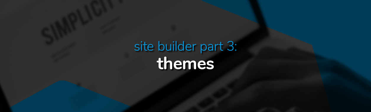
Now that you’re familiar with the nooks and crannies of your website builder, it’s time to select a skeleton and add some meat to those bones. We’re talking about using one of over 100 templates to properly convey the personalised message your website is trying to share with visitors.
Certain templates may be better suited to certain kinds of websites, but nothing is set in stone. If you feel the template of a particular website works for you, there’s no reason why you shouldn’t stretch, cut, and replace all the bits you don’t want with the bits you do.
For the purposes of this guide, we’ll be using the template: Cook Healthy
We’ll be showing you how to create a website from the existing template which suited the design of our makeshift website. While most of the template elements are to our liking, some aspects will be changed and added to accommodate our personal designs. As a general note, you can navigate to the edit section of a specific element by clicking the pen button for that element.
With that in mind, let’s start with the header.
So, our blog template’s content is geared towards diet and healthy living. A fine choice but not one we’d be following. Our first order of business is to revamp the title, images and text to represent our own. Let’s start with the header section and navigation bar.
With our header image, we opted for a minimalist snail alongside our organisation name. We’ve imbued our little snail with a link that’ll take the visitor to the home page.

This is important because the entire block (snail image, Page Title text, and navigation bar) is shown on all pages of the website.
This allows users to navigate to the important pages wherever they are on the website. It’s not imperative that you do this, but it makes a massive difference for the user experience if they can shift between pages with ease, and the navigation bar helps them do that.
Our template had this setting checked already, but if it isn’t, simply ticking the ‘Show in all pages‘ button under the ‘Visibility’ tab will activate the feature.

For our snail header image, we thought an animation would be a nice little effect when first loading the page. To add an animation, click on the element you wish to animate and choose from the options available. Playing around with the options will prompt some activity so you can see how it looks without having to preview the page.
We settled with a slow crawl to the image location after one second, which we think is fitting for a snail.

The navigation menu is a menu element, as you may have guessed. You can adjust how many items you want in the menu, item names, link direction, and some other settings by clicking on the pen button.

We removed the blog item from our menu as our website didn’t need it. To add a new menu item simply click the ‘New Menu Item‘ button.
The cover image sends an important message to all who enter your website. It should leave no doubts as to what your website is about or what it hopes to accomplish, before even a single word is read.

To edit the picture, click on it and the related page structure tab will pop up to the right of your screen. You’ll find a host of buttons and options to choose from. Since we’ve taken a template which has an agreeable layout for our purposes, we won’t change too much of the structure.
That means we didn’t need edits like, alignment, spacing, visibility, and animations. Image size will also generally be set for each section if you choose a template.
If, however, you’re making your website from a blank sheet, you’ll need to be more careful with how you allocate image size, alignment, spacing etc. since every nook and cranny on your website will have to be accounted for by you, and a miscalculation could be a layout disaster.
After we’ve added our cover image, we click the ‘Don’t scroll background’ button along with the top-centred position. This’ll ensure that when visitors scroll, they’ll see more of the picture until it’s offscreen. We’ve also decreased the opacity slightly to make our text more readable.

Now that the image is mostly done, we head over to the text section of the cover image (and for the rest of our website as well.)
The current font doesn’t convey the message we want so we change it to something a bit more adventurous.
Click the cover image text and the ‘Edit Text’ button to the right, then as we mentioned earlier, the pen button will direct you to where you want to be when looking for additional options.
You’ll be staring at a text styles screen, where you’ll be able to edit the specifications of your H1, H2, paragraph text, highlighted text, etc.

We adjusted the size slightly and recruited a new font by searching and then adding one which we liked.

You’ll notice that the adjustment we made was for the entire H1 category, so all H1s on the website will show these same changes we made for the cover image text, assuming H1s are used elsewhere on the website.
You can use this moment to set the specs for each text category if you prefer, or simply deal with it when you make use of it. We made some changes to our paragraph text, Page Title text, and Highlighted text since we had the setting box open.
After our text category specifications had been set, we decided to make it a bit more glamorous by adding some shadows to our text, and also adjusting the visibility to make it readable through the cover image.
To edit the shadow of a text, click on the pen button next to the word ‘Shadow’ and you’ll be able to choose the angle you want the shadow to fall, as well as the opacity, blur, and colour. We added a small amount of blur with a light source at the top so the shadow falls below the text.

We then also ensured the visibility was to our liking and made some retrospective adjustments to the cover image opacity to ensure all text on our cover image was clearly readable.

Next up we have our different fields of specialisation and topics of interest regarding molluscs. Each of these topics has a relevant picture as well as a button with some text that holds a link.
Adding a button element holds a link by default, but any element has the option for a URL to be added to it. As we’ve already covered how to add images, we’ll get straight to business with the buttons.
You’ll notice that each button on our website has text. Text is not an integral part of the button feature, but it does help the user navigate a lot better. You can see the option to add text in the page structure section on the right-hand side once you click on a button.

Right below that you’ll see where the URL for that button leads as well as the option to edit it. The button page structure options has some of the same customisation options as the text and image options, so it shouldn’t look too unfamiliar.

We decided to add an opaque background to ensure that the text for our buttons could be read as each picture was different and accounting for readability was a bit of a problem.

To add an opaque background simply head to the background section on the button options and move the colour palate to the desired location. An alternative way of making the text readable is to decrease opacity for the images, as we did with the cover image. We decided to not follow that route on this occasion.
After the directory, we have our mission statement alongside an image we think conveys our perspective and drive to our work.
Below our mission statement we have another button that takes visitors to our about page. We set the background of the button to be one of our brand colours.
For the entire block, we opted to add a border to allow for a break in white space. We went with a circular border around the mission statement into sharp edges around the image. We also used our brand colour blue and topped it off with a long shadow.
To customise a corner individually, check the box that says, ‘Use different corners‘. This allowed us to create the D shape you see in the image. To create different patterns for each section of the border, click ‘Use different borders‘.

After that we opted for a max size shadow with max blur at an angle we thought complimented the feel of the page.

Below that, we added some accreditation certificates to showcase our affiliations and standards.
This goes without saying, but only showcase certificates or accomplishments you legitimately acquired. Lying about your achievements is a sure-fire way to destroy user trust.
To start we select the tiny plus button below or above the section we want to add an element to. Since we want this below the mission statement, we click the plus button below the mission statement.
From there we click ‘Layout‘ and choose one that allows for three blocks to the left or right of each other. To add our accreditation certificates, we simply change the background of the block.

If the image is not showing fully, uncheck ‘Auto‘ and choose the centre position. It’s also a good idea to uncheck the repeat functions ‘Horizontally‘ and ‘Vertically’.

Once we’ve added our accreditations, we add a final word from our director (which will be you for your own website, of course).
We add another circular edge border around the text and fill it with our brand colour.
Finally, at the end of the page we have room for a few more buttons. Using what we’ve learnt already, we add a few button elements to the bottom of the page with our relevant social media platforms.
Remember: You can add images and insert a link or use the button element and add an image as a background. Either way works.
For our about page, we used much of the same elements we made use of for our home page. These included adding shadows to our header text and some blocks, opting not to scroll the background of the header image, adding URLs to images or sections that need to link elsewhere, and adjusting text to suit the page layout.
We don’t have any video elements on our page, but figured it may be useful to offer a quick guide on how to make use of this element since it’s likely to be relevant to your website.
To start, click the media file and choose the platform or format you’d like to use. We’ll use YouTube since it’s the most common platform. Once the element appears add the YouTube link in the available square and decide from when you’d like the video to start playing. As simple as that.

If you have your own video content, choose the ‘Video’ element from the ‘Media’ button. With this you’ll have a bit more freedom as to how the video shows. You’ll be able to loop, mute, and decide on the thumbnail. All of which you can’t do when you’re embedding a video from a popular site like YouTube.

Finally, our contact page shares a basic outlay of how to reach us and where to find us.
We’ve added some basic text sharing our address and telephone number. The major element for this page is the form field.
The form element allows your visitors to reach out to you from your website without much hassle. Simply choose the fields you’d like to include and ensure that the important ones are marked as compulsory.

Depending on the type of ship you’re running, you may need attachments, a Google reCAPTCHA, or an adjustment on your SMTP protocols. All of which can be adjusted in the page structure tab when you click the field element.

That about wraps up part three of our Site Builder series. We’ll see you again in part four where we go over the cart functionality of our Site Builder.

Let your creative juices flow by making the most of our Site Builder 7-day free trial. It's the perfect testing ground without commitment

Save yourself some time by learning how to use the AI Text Generator in Site Builder so you can spend more time on design.

Learn how to add a basic blog element to your Website Builder and start amassing a following with your written content by following this guide.